Evaluation &
Improvement
Strategy e-Learning
platform
Leer je Erfgoed
-
 ClientErfgoedAcademie
 -
 RoleUX/ UI Designer, UX Researcher, Digital Strategist
 -
 DeliverablesHeuristic Analysis, Prioritisation Matrix, Annotated Screens, Redesign Mockups, Digital Strategy
 -
 Scope3-week heuristic audit, usability walkthroughs, and UX/UI proposals
The platform faces significant usability challenges: inconsistent layout, outdated design, lack of mobile responsiveness, and limited flexibility due to its custom architecture.
I was asked by the ErfgoedAcademie to evaluate the platform, identify critical usability issues, and propose feasible improvements that align with system constraints and the available budget.
Based on an expert review of the current platform, several testable hypotheses were formulated to guide the heuristic evaluation and subsequent user research. These statements indicate potential usability issues that require validation.
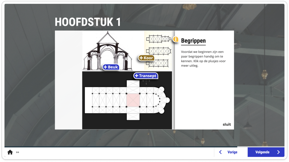
The platform was evaluated using Nielsen’s 10 usability heuristics, combined with basic accessibility and e-learning UX principles. For each key screen, the most critical issues were identified and rated on a severity scale from 1 (minor) to 4 (critical). Below, each screen highlights three prioritised issues, ordered from high to low severity, to illustrate the main usability risks and opportunities for improvement.
- High SeverityThe grid (four modules per row) collapses on smaller screens, making text overlays unreadable and buttons too small to tap. This significantly impacts accessibility and prevents task completion on mobile and tablet devices.4
- Medium SeverityCalls to action and duration labels rely on hover states and are not immediately visible, reducing clarity and discoverability for first-time users.3
- Low SeverityMinor inconsistencies in icon usage and hover feedback slightly reduce visual coherence but do not block interaction.2
- High SeverityHotspot panels overlap with the main visual content and are constrained by a fixed interaction container. On smaller screens, content risks being partially hidden or cut off, making it difficult to read additional information.4
- Medium SeverityDifferent hotspot icons and button styles are used across screens, reducing consistency and recognisability. Users must re-learn interaction patterns instead of relying on visual familiarity.3
- Low SeverityThe relationship between hotspots, supporting text, and page navigation is not clearly communicated. While the interaction works, the lack of visual guidance slightly increases cognitive load.2
- High SeverityCorrectness feedback is communicated only through colour (e.g. blue for correct, pink for incorrect), without text or icon support. This creates an accessibility issue for colour-blind users and reduces clarity for all users, especially in low-contrast environments.4
- Medium SeverityFeedback messaging is visually detached from the selected answer. Users must infer why an answer is correct or incorrect, which weakens learning reinforcement and increases uncertainty.3
- Low SeverityAction buttons such as “Opnieuw” and “Volgende” are functional but visually understated. Their states do not clearly guide users through the learning flow, although navigation remains possible.2
To complement the heuristic evaluation, this case study draws on the results of a user survey conducted in 2025 by the ErfgoedAcademie, with a parallel survey run by the joint platform VBNE (Leer je Groen). The combined response reached over 270 users, consisting primarily of volunteers and a substantial group of heritage professionals.
The survey aimed to understand overall user experience, perceived usefulness, and future relevance of the platform. The survey did not focus on detailed usability issues or task-based testing, but instead captured users’ general perceptions of learning experience, accessibility, and value.
Respondents describe Leer je Erfgoed as:
- Accessible and easy to use
- Clearly structured and intuitive to navigate
- Well-balanced in its use of text, visuals, and assignments
- Suitable for both volunteers and professionals seeking introductory knowledge
While the experience is positively rated, many users express a need for greater depth, clearer learning paths, and more specialised content, especially among professional users. There is also a recurring desire for improved mobile and tablet usability, more frequent updates, and clearer progression through modules.
These findings suggest that the platform’s foundation is trusted and well-received, while its long-term growth depends on refinement, scalability, and more targeted learning journeys.
- 90%Would be RecommendedA strong majority of users indicate they would recommend Leer je Erfgoed to others, reflecting high trust and perceived value.
- 100%Usability SatisfacionMost respondents rate the platform’s usability positively, describing it as clear, accessible, and easy to navigate.
- 65%Need for Mobile / Tablet UI ImrovementMany respondents mention the mobile and tablet experience as a key area for future improvement, particularly for sustained use.
- Mobile-specific usability or responsiveness issues
- Accessibility compliance (e.g. contrast, tap targets, keyboard navigation)
- Cognitive load and content density
- Interaction clarity in complex components such as hotspots or quizzes
Rather than pursuing a full redesign, the strategy focused on high-impact improvements that could realistically be implemented within the existing platform architecture.
Particular emphasis was placed on issues affecting accessibility, task completion, and clarity of the learning flow, especially on smaller screens.
Improvements with high user impact and low to moderate implementation effort were prioritised, particularly where changes could be applied consistently across multiple screens. Issues with lower severity or requiring substantial structural refactoring were documented as future opportunities, rather than addressed within the current scope.
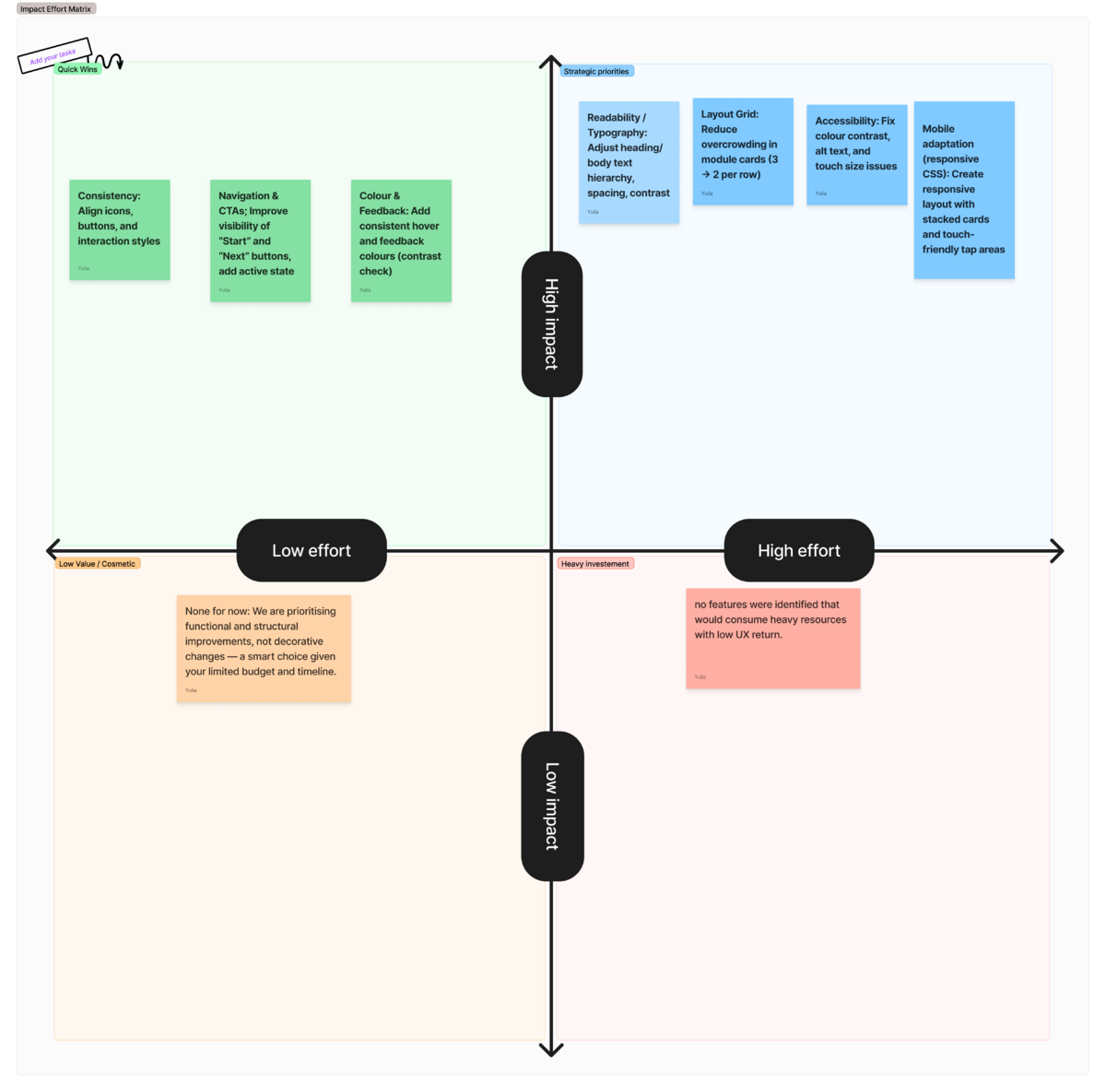
Based on the prioritisation outcomes, a set of before/after mockups with annotations was created to translate usability findings into concrete, implementation-oriented suggestions. These mockups are exploratory rather than final and are intended to support discussion with developers by clarifying layout, hierarchy, and interaction improvements within the existing platform constraints.
Annotations highlight what should change and why, indicate which elements are intended as global updates, and help estimate technical effort without prescribing specific technical solutions.
The proposed improvements focus on clarity, accessibility, and consistency, prioritising changes that can be applied across multiple screens and deliver the highest user impact within a limited timeframe.
The evaluation showed that while incremental usability improvements are possible within the current platform, fundamental limitations of the legacy codebase make deeper redevelopment costly and difficult to scale. For this reason, the strategic focus shifted toward rebuilding on a new, AI-powered e-learning platform with greater flexibility and long-term potential.
These insights now serve as design and UX requirements for the new platform, helping ensure that future development is grounded in real user needs rather than assumptions. In this way, the evaluation becomes a strategic bridge—connecting a trusted but constrained legacy system to a more flexible, scalable learning environment designed to support long-term user growth and evolving educational goals.
