-
 ClientOne2One.Run Start-up
 -
 RoleUX/ UI Designer
 -
 DeliverablesUX Research, New Event Feature, MVP Mobile UI Design
 -
 Timeline2 weeks
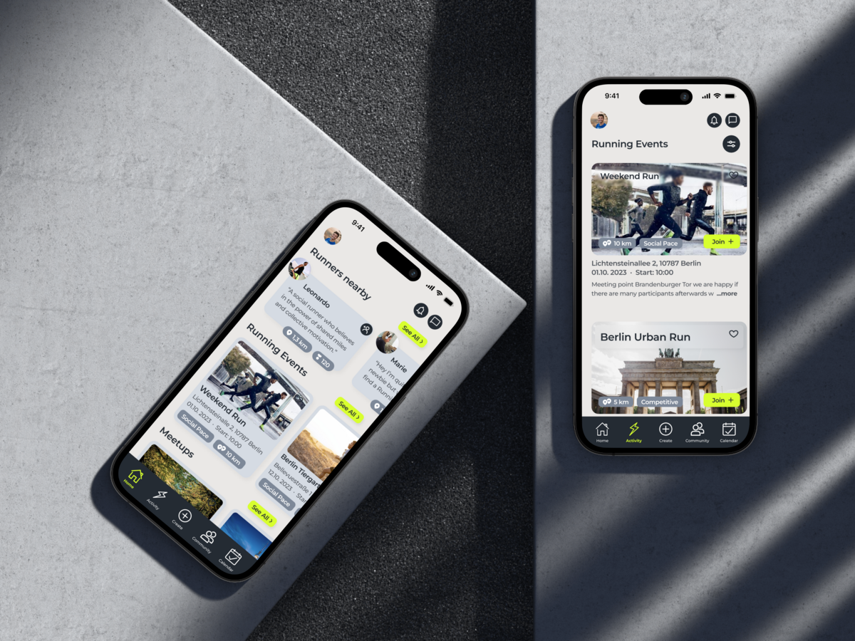
The Minimum Viable Product re-design prioritises a sleek UI and a user-centric experience to not only boost event creation but also foster a thriving running community with a particular emphasis on simplifying connectivity and planning for users.
To address this challenge, we applied a combined primary and secondary research methodology. This multi-pronged approach provided actionable insights into user needs and preferences, forming the basis for the event creation feature and the mobile app UI redesign. To gain rapid, relevant feedback, primary research targeted the existing app user base.

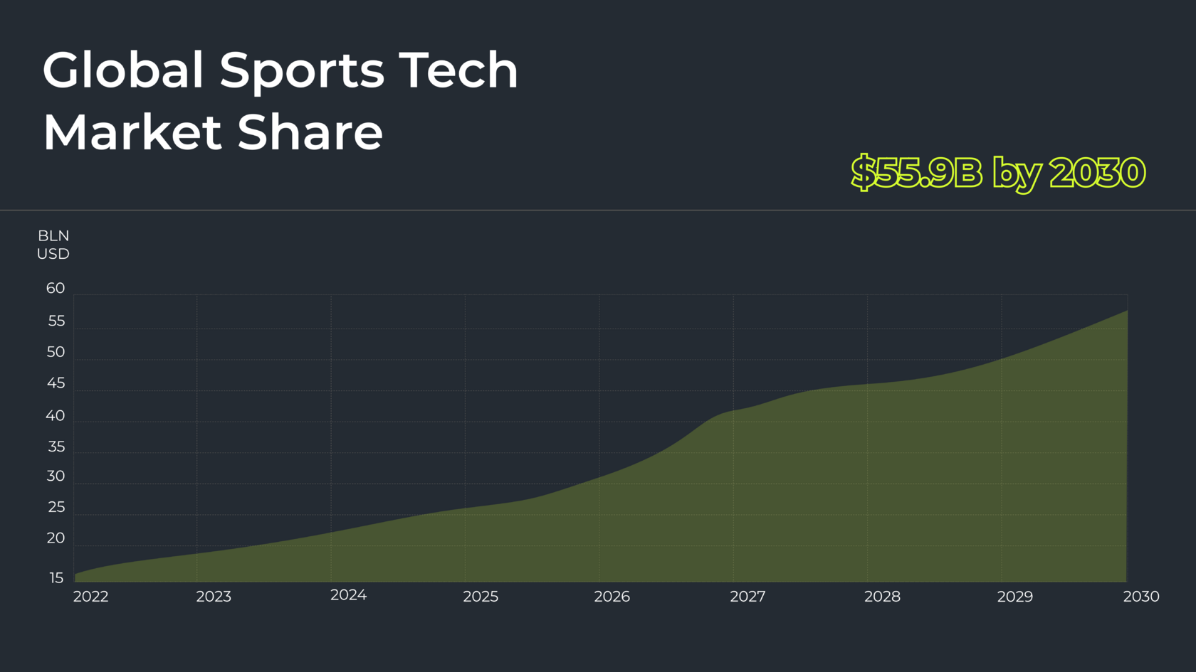
Our research phase kicked off with market research, revealing a booming global sports technology market with a projected CAGR of 17.9% and a forecasted size of $55.9 billion by 2030.
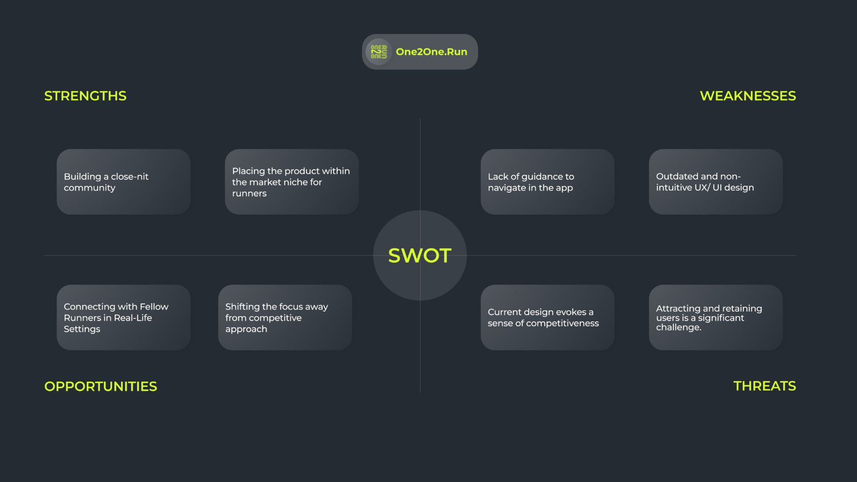
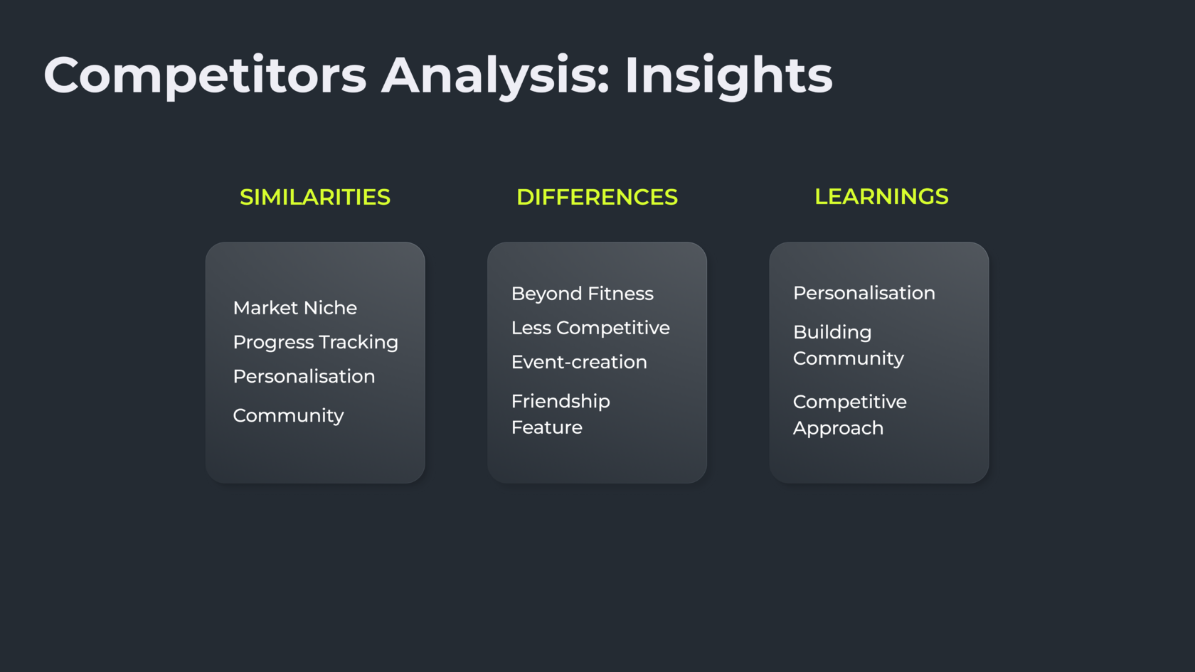
We then analysed major competitors like Strava, Nike Running Club, Adidas, and Asics. While these apps share One2One.Run's niche and offer community and personalization features, their focus leans towards a competitive approach to running routines. This positions One2One.Run uniquely within the running app niche, fostering a close-knit community with a low barrier to entry and a beginner-friendly approach. It capitalises on the opportunity to connect runners in real-life settings.

Primary Research
Building on the insights gained from market analysis and the stakeholder interview, we conducted a comprehensive user research phase with One2One.Run app users. This research combined qualitative and quantitative methods:
- Qualitative Research: Stakeholder interviews and user surveys provided valuable insights into user demographics, goals, and pain points.
- Quantitative Research: User surveys and usability testing allowed us to gather measurable data on user behavior and preferences.
The initial research phases (stakeholder interview and secondary research) helped us formulate hypotheses about user needs. Our primary research then focused on testing these hypotheses and gaining a deeper understanding of:
- User Demographics: Who are the core users of the platform?
- User Onboarding: How do users find and navigate the app initially?
- User Pain Points & Needs: What are the main challenges users face within the app?
- Feature Preferences: What functionalities do users find most desirable? (e.g., matching based on running preferences)
Surveys revealed a strong user preference for connecting with runners who share similar interests, routines, pace, and location. Usability tests further identified core weaknesses in the app's UX/UI design, which were hindering user retention and engagement.
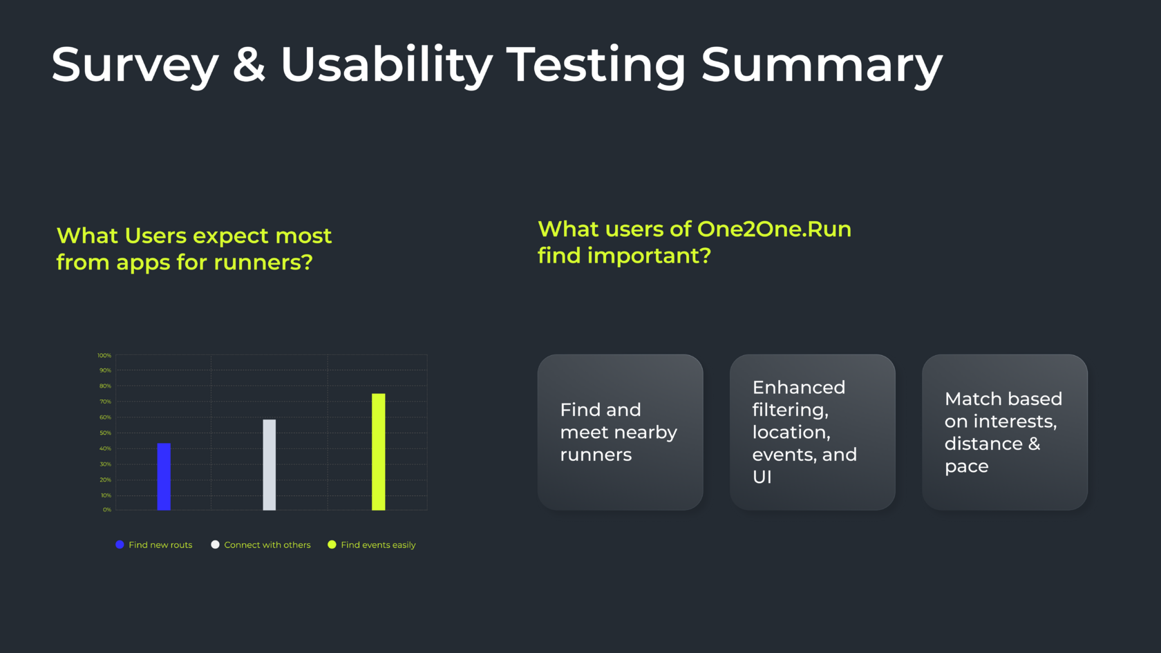
User research insights led us to define Oliver, our 32-year-old Social Runner persona who recently moved to Berlin seeking running buddies and community. To address Oliver's needs within the identified problem statement – our design challenge, we brainstormed using Crazy 8's and MoSCoW methods to prioritize solutions. Focusing on "Must-Have" features, we prioritized a clear onboarding process, event/match recommendations nearby, an interactive workout calendar in an enhanced UX/UI design.
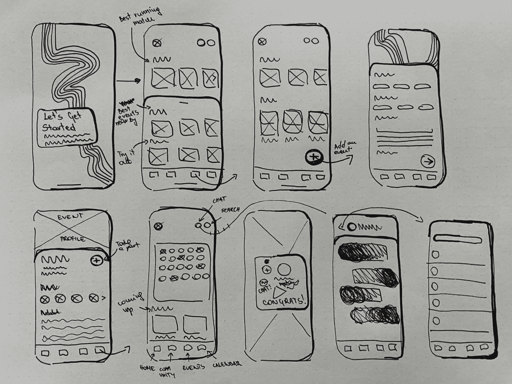
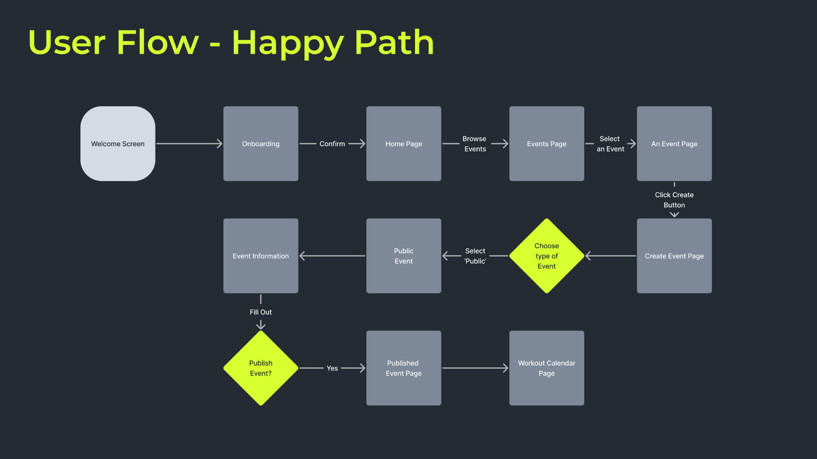
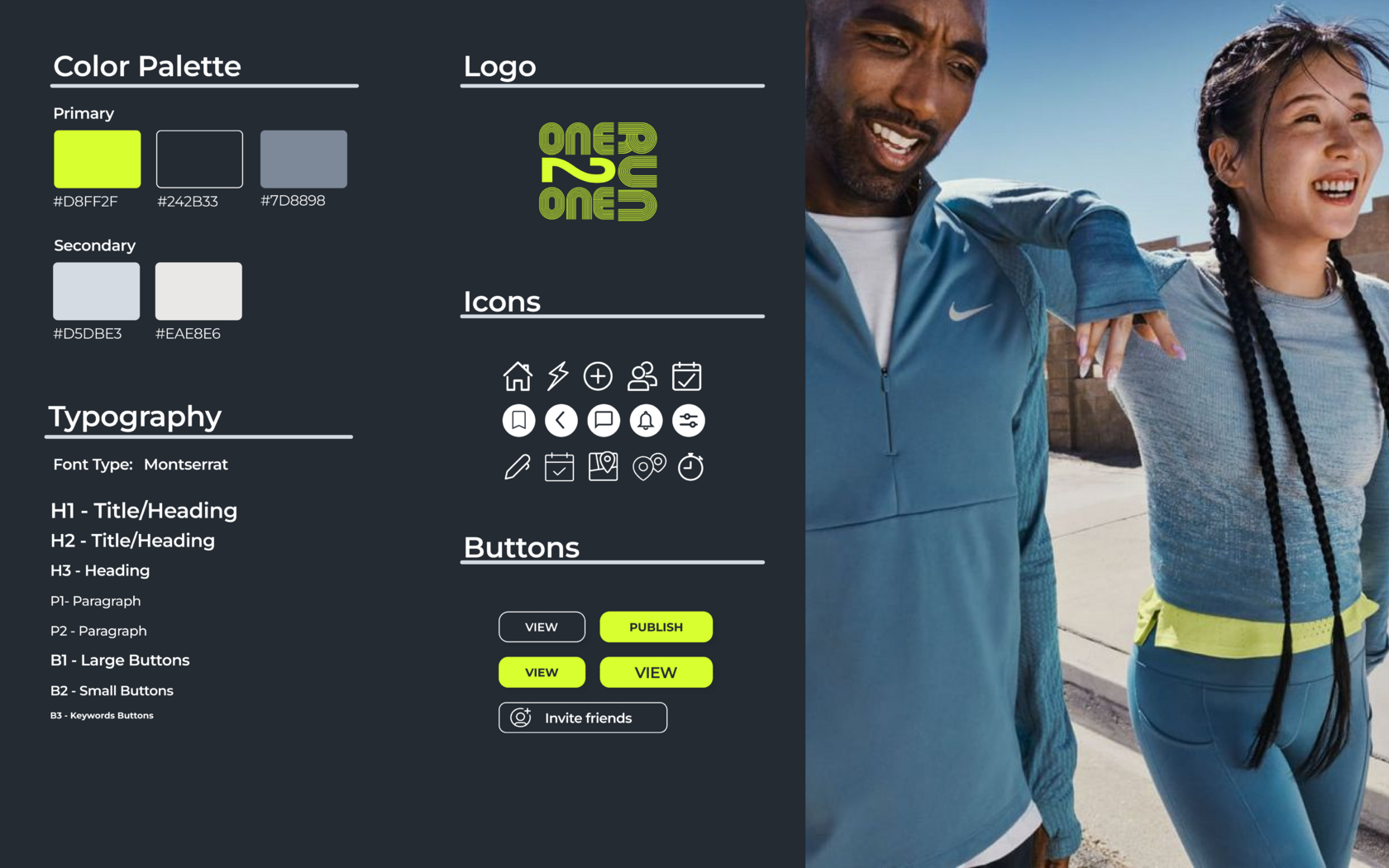
Building on initial sketches, our design team crafted a refined user journey for Oliver within the One2One.Run app: after a structured onboarding showcasing the new UI, he browses events, joins one, creates his own, and tracks his workouts in a personalized calendar. To evoke a modern and friendlier vibe to the brand, we chose a lively lime green as the primary color, complemented by neutral greys for an urban touch.
Testing Information Architecture on the Main Page:
We employed A/B testing to ensure a user-centric design approach. Initially, we compared the new low-fidelity wireframes with high-fidelity screens of the existing app design. This helped us evaluate the user experience specifically regarding information layout on the home page.
Our A/B test focused on how users interacted with the main page and its ability to help them find runners and events. We presented them with two versions of the design in low-fidelity wireframes showcasing two different approaches:
- Option 1 (Based on Existing Design): This mirrored the current app's two-folded vertically-oriented structure with tabs for runners and runs. While in the old design there is no filtering options offered for the information, in the new design, the runs tab offers a further split for challenges and events. Runners are filtered at the same time by rank and proximity.
- Option 2 (Our Proposed Redesign): We abandoned the existing app's tab structure. Instead, we offered a horizontal split of the information on the home page:
- Top: Best running matches based on user preferences/suggestions.
- Down to the Bottom: Nearby runners and runs.
Based on feedback, we moved forward with a mid-fidelity design emphasizing the event creation feature through a central placement in the bottom navigation bar. We conducted another A/B test focusing on the new user experience (UX) for filtering and creating events within the updated user interface (UI) in two options:
- Option 1: Split social running into “events“ and “challenges“ with a tab, intoduced in the middle of the home page, along with the filtering option
- Option 2: Vertical structure to different categories of social running.
The user response was firmly positive about the Re-design Option 2. Users validated the new UI, highlighting its clarity, user-friendliness, and overall less competitive and friendlier experience compared to the existing misleading design. Notably, users found it easier to locate sport events and the event creation feature compared to the challenges of the old UI navigation.
Building on initial sketches, our design team crafted a refined user journey for Oliver within the One2One.Run app: after a structured onboarding showcasing the new UI, he browses events, joins one, creates his own, and tracks his workouts in a personalized calendar. To evoke a modern and friendlier vibe to the brand, we chose a lively lime green as the primary color, complemented by neutral greys for an urban touch.
This project yielded valuable insights applicable to mobile app development within the competitive sports technology space. Here's what we discovered:
- User-Centred Design Delivers Results: In-depth user research exposed usability issues hindering the user experience. By addressing these issues through a user-centred UI redesign, we improved the app's usability and clarity, leading to a significant increase in user retention and event participation. This demonstrates the power of prioritising user needs throughout the design process.
- Community Fosters Engagement: The project reinforced the importance of fostering a strong community within the app. This community can provide support, motivation, and a sense of belonging, encouraging runners to maintain their routines and participate in events.
- Differentiation is Key: A clear and unique selling proposition (USP) is crucial for any app to stand out in a crowded marketplace. One2One.Run can leverage its focus on user needs and building a strong community experience to differentiate itself from competitors in the sports technology market.
- Onboarding Matters: A well-designed onboarding process is essential to ensure users understand the app's features and functionalities effectively. A smooth onboarding experience can lead to higher user retention and engagement from the very beginning.
- Iterative Design for Success: Throughout the project, we employed an iterative design approach. This involved continuous evaluation and refinement based on user feedback through A/B testing. This ensures a user-centred design that prioritises ease of use, clear information architecture, and a welcoming atmosphere for runners to connect and create events.
These learnings highlight the importance of understanding user needs, fostering a strong community, and continuously iterating on the design based on user feedback. By prioritising these elements, mobile apps can create a more engaging and successful user experience.
- Expanding the Platform: The design team recommends exploring the possibility of expanding the platform to encompass other sports beyond running.
- Integrating Progress Tracking: Implementing GPS-enabled progress tracking features could further enhance user engagement and contribute to achieving the startup's KPIs and overall business goals.
